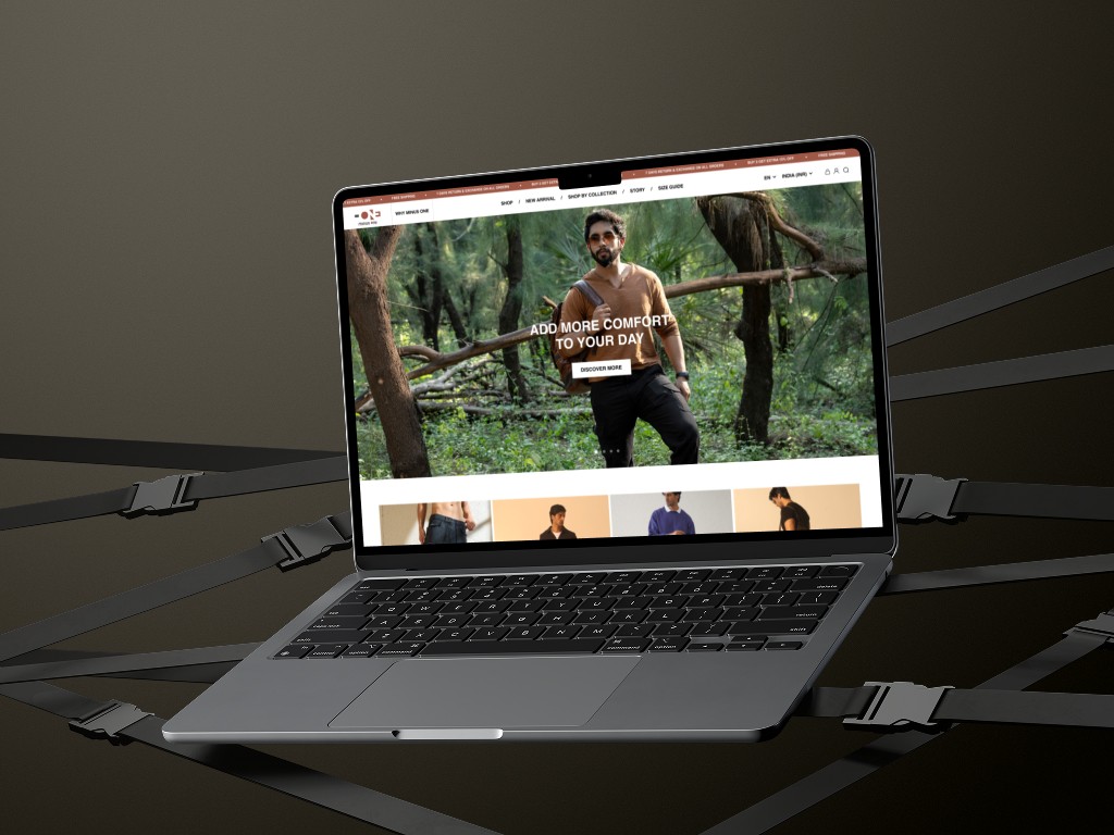
Minus One Lifestyle is an Indian direct‑to‑consumer apparel brand focused on premium comfort wear—especially chinos and cargo pants with unique features like moisture‑wicking fabrics and autofit stretch technology. The goal of the redesign was to elevate user experience, simplify navigation, and reinforce the brand’s comfort‑first appeal while boosting conversions across India.
As the sole UI/UX Designer, I reimagined the product browsing, category funnels, and detailed product pages to match user needs across a wide age range. I led research, ideation, wireframing, and high‑fidelity design handoffs for mobile and desktop.
Discovery & Research
User Research
Goals:
Understand how users browse, evaluate, and purchase comfort-focused clothing online, and uncover points of friction.
Methods Used:
Heuristic Audit of existing site
Competitor Benchmarking (Snitch, Uniqlo, Lululemon, Pee Safe)
Lightweight Remote User Interviews (4 participants, ages 22–34)
Hotjar Session Recordings + Heatmaps
Google Form Survey sent via Minus One's Instagram
Key Patterns Identified:
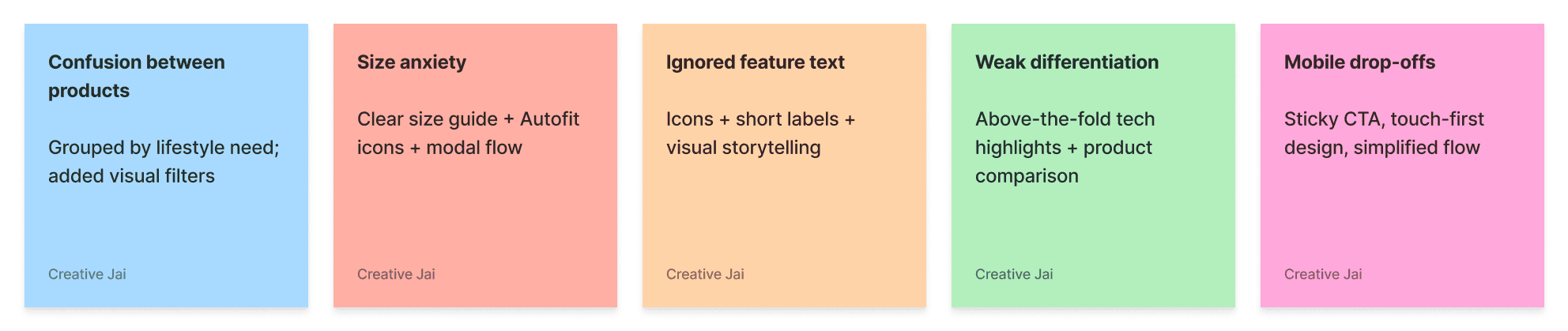
Users couldn’t distinguish between product types (Daylong vs. Travel Chino)
Uncertainty around sizing caused drop-offs
Long product text blocks were ignored, especially on mobile
Users didn't immediately understand brand USPs
Competitor Analysis & Benchmarking
I conducted a competitive UX audit focusing on product discovery, visual storytelling, and mobile usability. Brands included:
Competitor | Strength | Weakness |
|---|---|---|
Snitch | Trend-focused UI, quick load times, modern grids | Weak product differentiation and value messaging |
Uniqlo | Clear product stories, good filtering system | Text-heavy pages, not optimized for Indian UX habits |
Lululemon | Excellent visuals and tech-feature communication | Too premium for mid-range Indian audiences |
FableStreet | Premium feel and great product discovery UX | Lacks microinteraction consistency on mobile |
Takeaways:
Combine Uniqlo's product storytelling with Snitch's speed and simplicity
Use Lululemon's icon-based feature communication without overwhelming the UI
Focus on mobile-first hierarchy like Pee Safe, but with more branded depth
How I Found the Problem
Through audits and interviews, it became clear that:
Users weren’t converting because they weren’t understanding.
They couldn't tell the difference between products, didn’t trust the sizing process, and were overloaded by text-heavy pages that failed to showcase the value of Autofit, 4-way stretch, and lifestyle-driven categories.
Organizing the Information
To structure clarity:
Grouped products by use-case, not fabric type (e.g., All-Day Comfort, Travel-Ready)
Introduced visual badges: Autofit, Moisture-Wicking, No-Itch Waistband
Added collapsible sections for return, delivery, and size details
Pulled key USPs above the fold
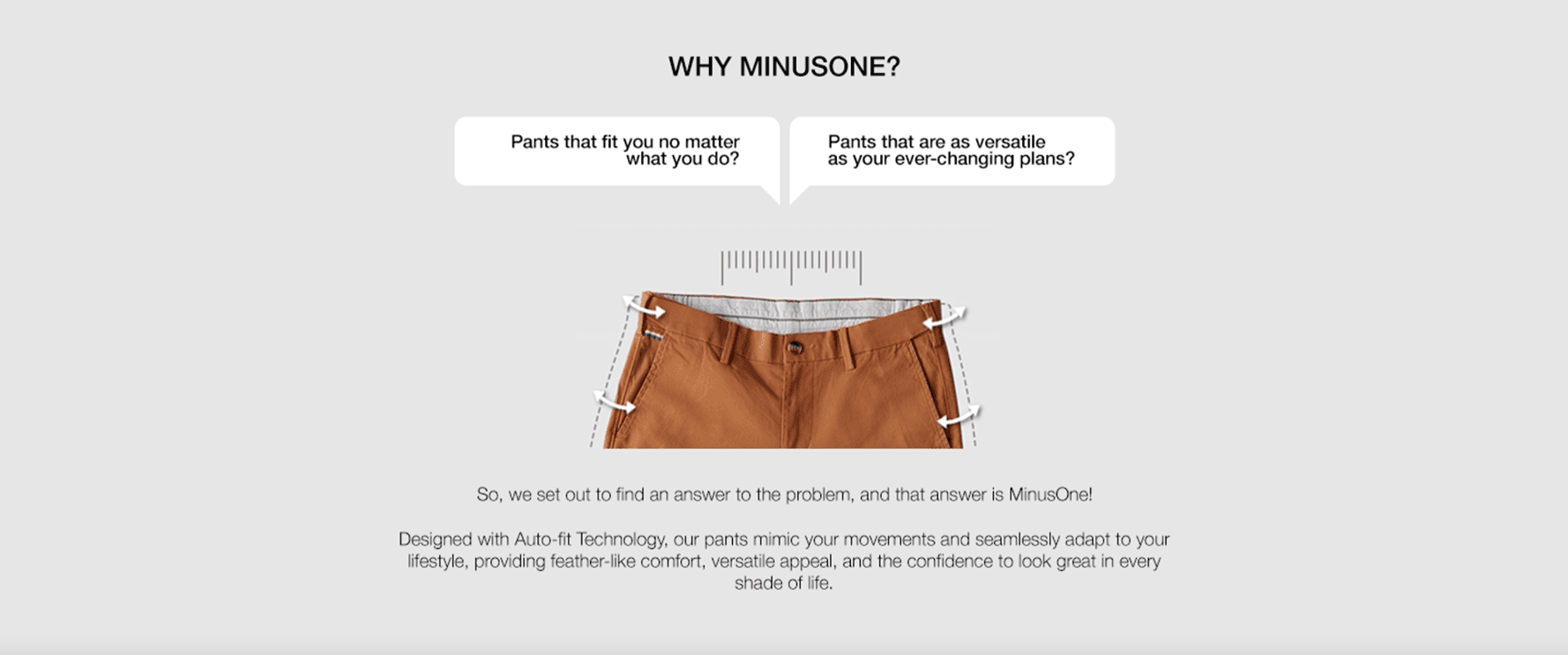
Visualizing the USPs
Designed a custom icon set to represent tech features (Autofit, Stretch, etc.)
Created mini-infographics to explain fit and sizing
Used lifestyle-driven microcopy to build emotional connection ("Moves when you do.")
Enabled quick-scan tags for each product in the collection grid
Brainstorming & Strategy
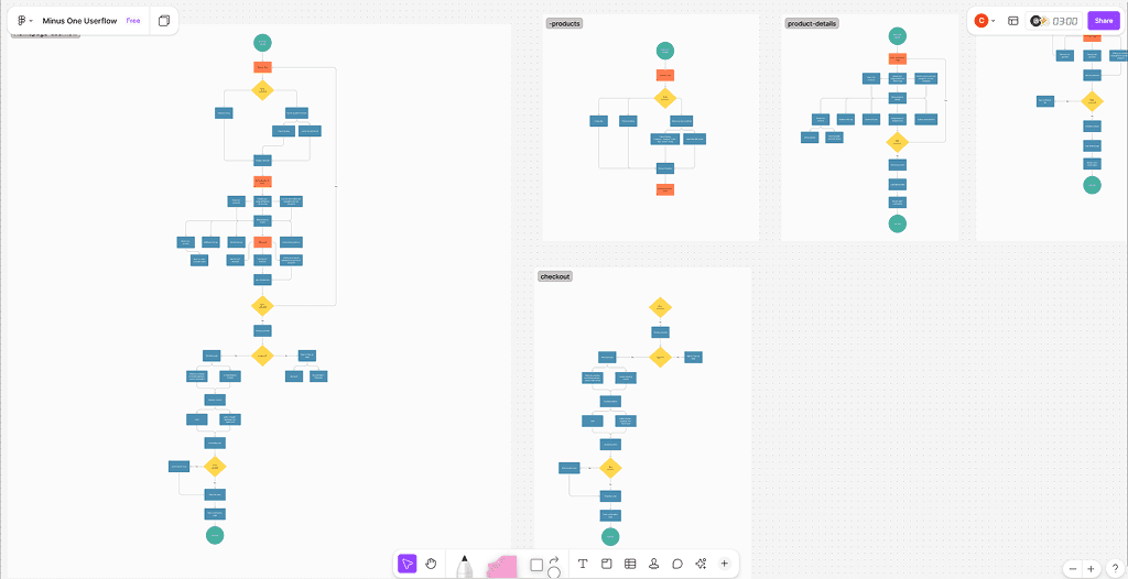
User Flow (Mobile-focused)
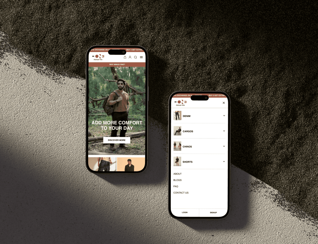
Wireframing & UX Planning
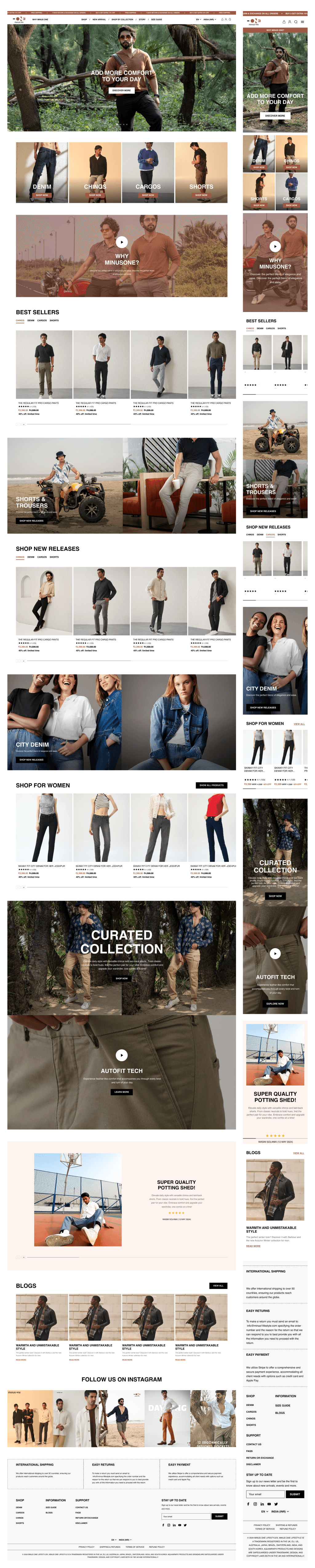
Wireframes prioritized scroll behavior, quick decision-making, and clarity across all touchpoints.
UI Design & Design System
Key Challenges & Solutions
Challenge | Solution |
|---|---|
Complex product categorization | Grouped items by use-case; simplified filter UX |
Autofit messaging unclear | Designed icons + stretch range infographic |
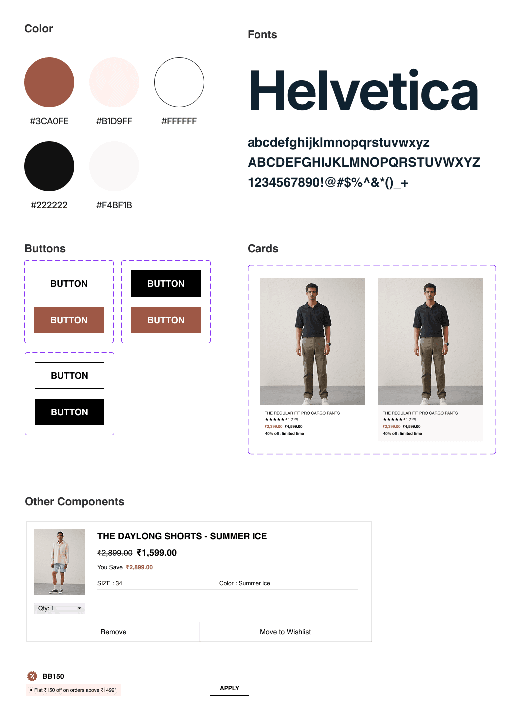
Lack of design consistency | Created Figma UI kit with reusable, scalable components |
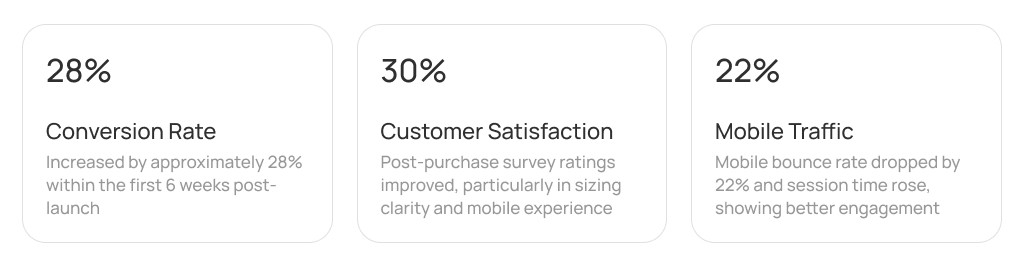
Results & Outcomes
Simplified user flows across mobile and desktop
Better storytelling of product benefits
Increased clarity and confidence around sizing
Positive feedback from client on brand alignment and flow
What I Learned
This project reinforced the importance of clear product storytelling in e-commerce, especially when the product includes unique technology or features. I learned how visual communication (icons, infographics, layout structure) often speaks louder than paragraphs of explanation.
Key takeaways:
Always consider how users evaluate and compare similar products
Visualizing features like Autofit and 4-way stretch significantly improves user understanding
A good design system simplifies future scaling and collaboration
Mobile-first UX is not just a responsive layout — it's a mindset that defines structure, prioritization, and usability